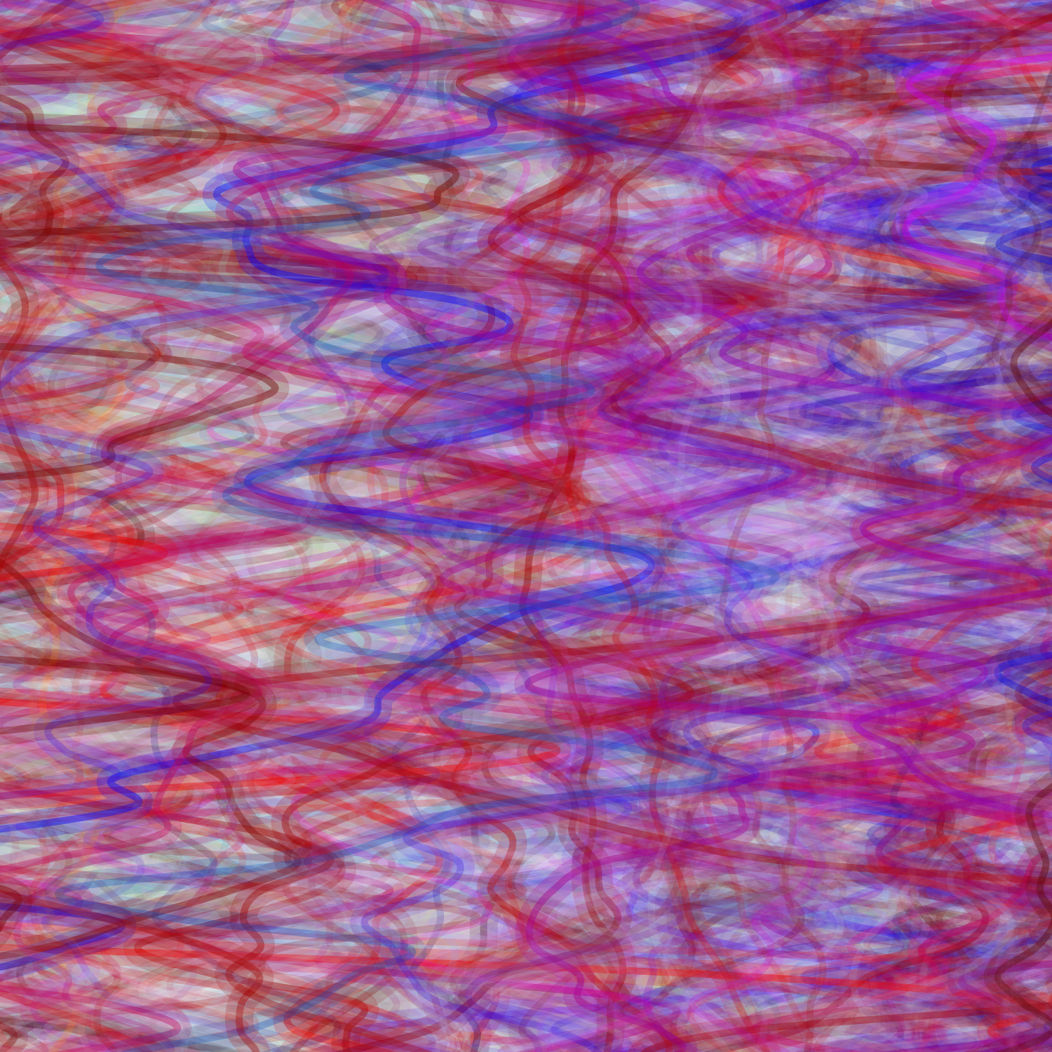
So one comment that I received during the previous critique was the lines were pretty jagged. I realized that this would be easily solved by using curveVertex() instead of vertex() in Processing .
Here was the resulting image:

Another suggestion I received was that the image did get a bit busy. So I experimented a bit, having the program draw only every other beat with a smaller line in the middle (double stroke).

I did like this a little better, but I disliked how thick the single stroke (one without the overlayed middle line) looked. So I decided to do a few tests on varying this thickness. The above thickness is 4.
Single stroke (width = 1):
Single stroke (width = 2):

Single stroke (width = 3):

Ultimately, I ended up settling with the single stroke line with a width of 2. And a double stroke line with widths of 1 and 4. I liked the new variations in strokes. The effect was subtle, but added just another detail that can only been seen at a closer level.
After reviewing my print tests, I realized that a lot of the purple in my original image was no longer showing up. After struggling a bit, I learned about the gamut warning in Photoshop.
Here is my previous brightness test print. The yellow displays all unprintable colors. So once I raised the brightness to account for how dark the printer, a lot of color information was lost.

This was a pretty easy fix, by just converting my image to use a CMYK color profile.
I did a few more test prints using varying brightness/contrast for optimal image adjustment information for the four songs I picked from different musical artists.
Along the x-axis I have varying values of adjustment for contrast levels in increments of 20. Along the y-axis I have varying values of adjustment for brightness levels in increments of 10.

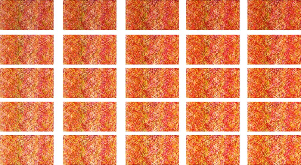


Here are the printed results (apologies for the bad cell phone picture):

The differences were very subtle (even harder to see in the photograph, I’ll try to put a better quality photo up in the future), but I ended up settling with a 40 brightness level increase and a 40 contrast level increase (fourth row from the top, third column). It will be nice to keep these for future reference.
After making the appropriate adjustments, I was ready for final prints!
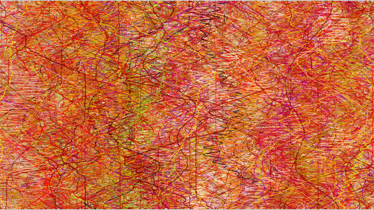
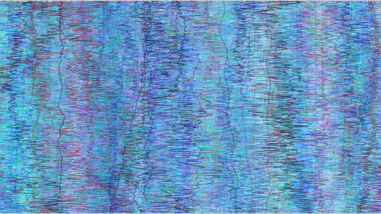
Here are the four final images (I would take pictures of them, but without a proper camera, the quality wouldn’t do it justice):

Kishi Bashi – It All Began With a Burst
Nujabes – Feather

ZZ Top – Sharp Dressed Man
Snoop Doggy Dogg – Who Am I
Mountings at Hobby Lobby ended up to be MUCH more expected than what others had mentioned in class. So, I only had one done. There has been talk that Copy Center is cheaper, so I either plan on checking their prices or try to do it myself.
